The visual rules behind the future-state AIC.sg homepage design. Each rule is traced to what AIC.sg shows today, to the AIC logo, or marked as our proposal.
Status: derived by observation from www.aic.sg on 12 October 2026. This is not AIC's official brand guide; where AIC has one, it takes precedence. See the homepage design
The AIC logo is used unaltered, as supplied on AIC.sg: full colour on white or cream, and the white version on charcoal.

Colour logo, taken from the site icon. Header use, on white or cream only.

White logo, as used in the AIC.sg footer. On charcoal only.
Tags show where each colour comes from. Hex values were read from the live site's styles or sampled from the logo file.
#D64214Buttons and arrows. White text passes AA at 4.5:1.#1F1F1FAll text, footer, the neighbourhood band.#E8DF4AFrom the "How can we help you?" band. Highlights on charcoal; charcoal text only.#FFF9E4From the advisory bar. Hero and quiet section grounds.#F05022Motif and accents only, never text.#F89C1DMotif only.#FCB61AAccent rule, icon discs.#DFE229Accent rule, icon discs.#A8320DText links and hover, for stronger contrast on white and cream.#55504ASecondary text.#E7DFC9Dividers and card edges.#0B57D0Keyboard focus ring only, so it never blends with brand colours.Open Sans, as used across AIC.sg today. Chinese and Tamil fall back to Noto Sans SC and Noto Sans Tamil (our proposal), which match its proportions. Base size is 18px, the same as the current site's buttons, and everything scales with the reader's text-size setting.
Live well. Age well.
In your neighbourhood
Get care and support
AIC connects seniors, caregivers and families in Singapore to health, ageing and care support.
Stay well · 保持健康 · Kekal sihat · ஆரோக்கியமாக இருத்தல்
Buttons keep the 8px corner used on AIC.sg. Cards are softer at 18px. Every pressable target is at least 48px tall.
| Element | Rule | Source |
|---|---|---|
| Primary button | Action orange, white bold text, 8px corners | AIC.sg |
| Button on charcoal | Sunshine fill, charcoal text | Proposed, using AIC.sg yellow |
| Cards | White, 18px corners, soft warm shadow, 5px colour rule | Proposed |
| Arrows | Action orange, always paired with a text label | Proposed |
Three arcs echoing the logo, in its orange, tangerine and lime. Our proposal. It is the only decoration in the system, used at most once per screen area, always behind content and never behind text.
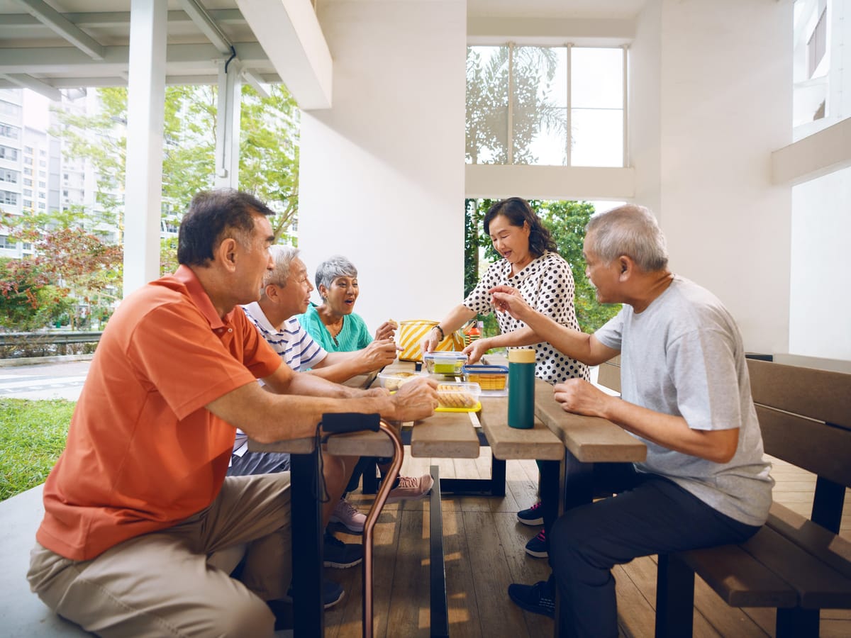
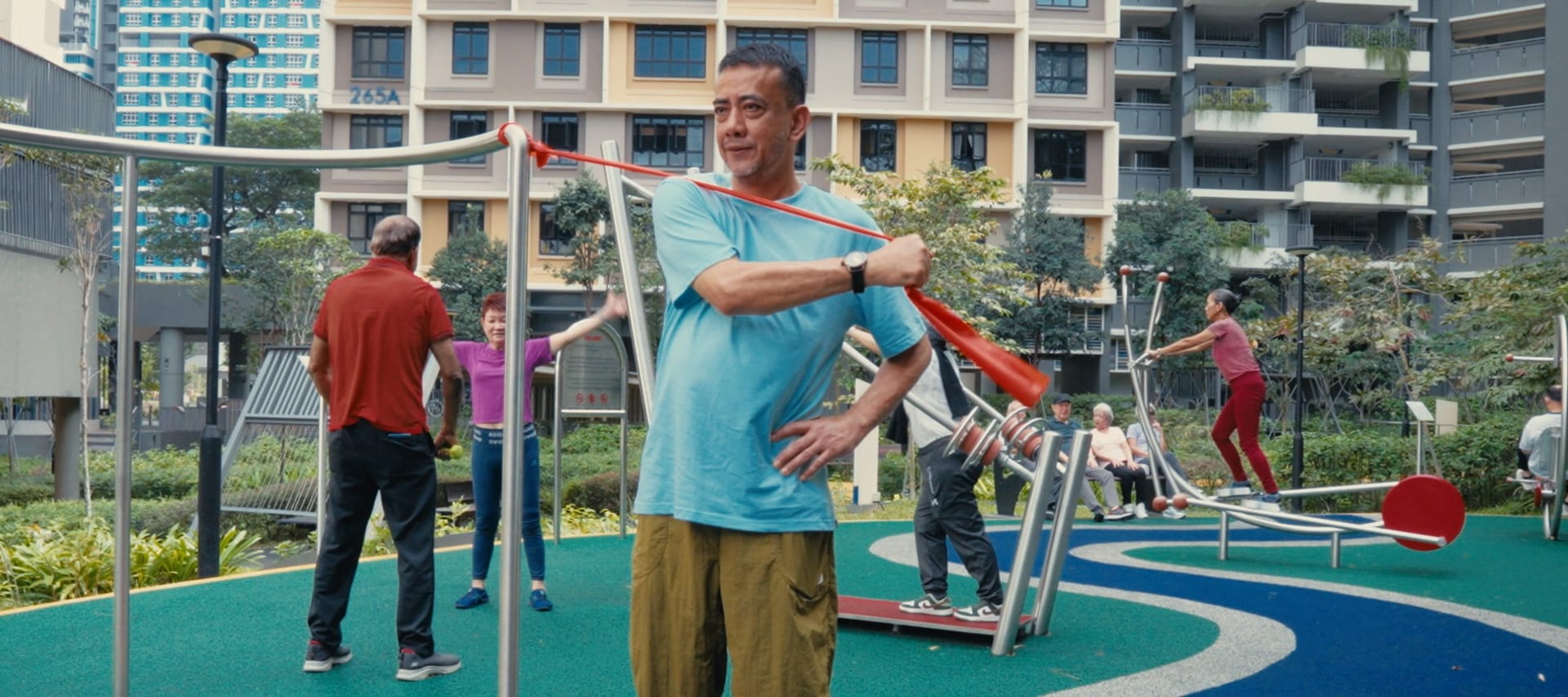
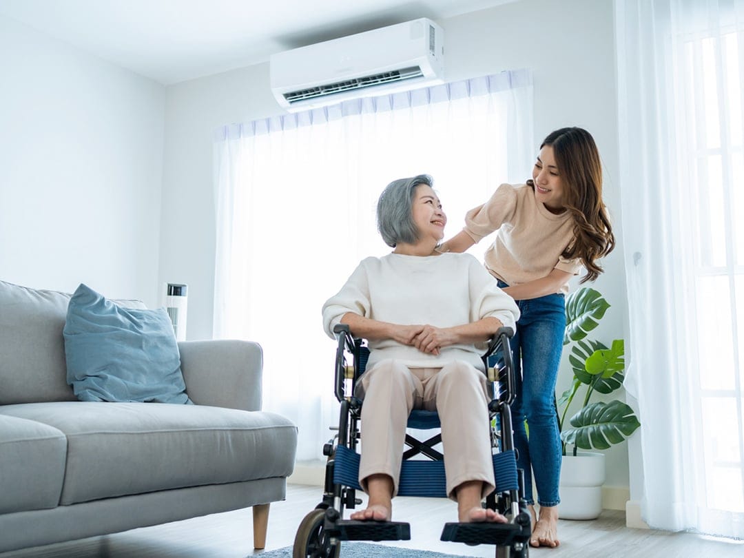
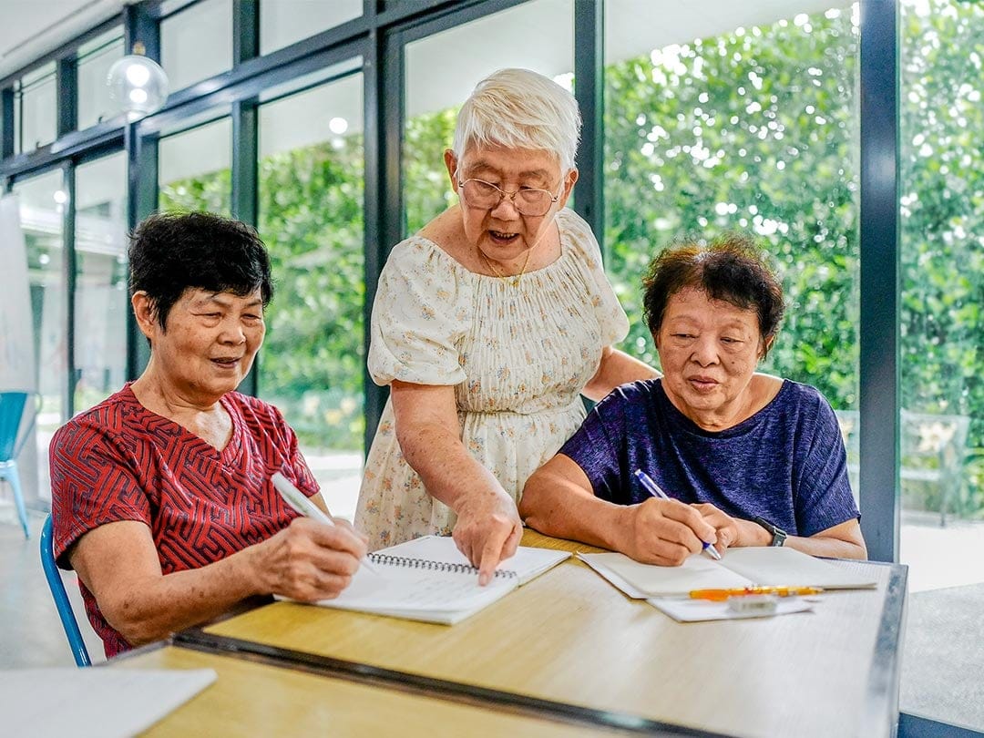
All photographs here are AIC's own, from the current site. The selection rule we applied: real Singapore settings, natural light, people doing something together, and seniors shown as capable.